ANTIBODY BINDING PLOTS AND 4PL OR 5PL CURVE FITTING (AbPlot)↑
Purpose: Develop a web-based graphing program to plot and analyze antibody binding data.
Development: AbPlot uses the the plotly.js library. I coded the user interface and a least squares regression function to fit the data to the 5PL equation in HTML/JS/CSS.
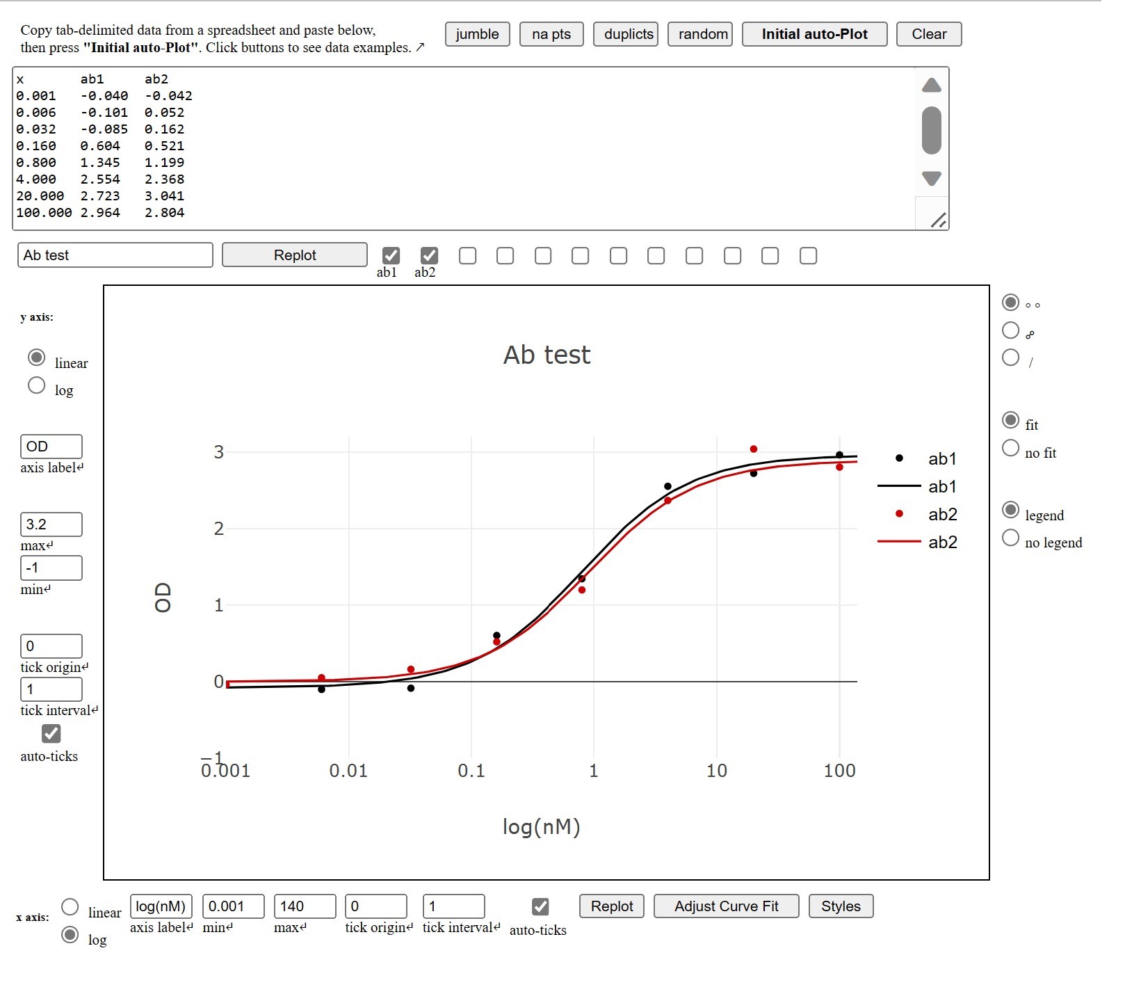
Features: The program takes up to 12 sets of antibody binding data, which are ideally copied from an Excel or Google Sheet and pasted into a text area. The data are automatically fitted into a 5PL equation and plotted on a semi-log scatter chart.
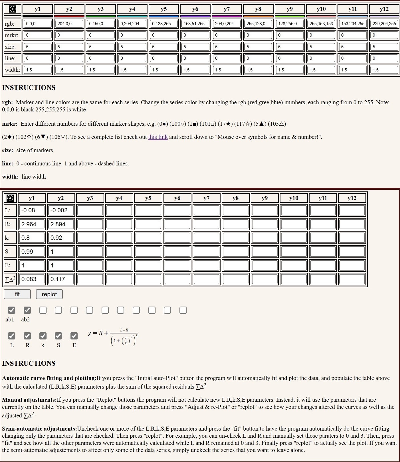
The 5PL parameters can be individually selected for re-fitting and re-plotting. For example, one can freeze the E parameter with the value of 1, which effectively converts the equation into 4PL, or set the plateaus to the known minimum and maximum, while re-fitting the data to the remaining parameters. The axes can be set to linear, or log and ticks can be either automatically or manually set. Colors, marker shapes and line types can also be individually selected. This first version does not calculate and plot error bars.
Note: I have written a similar program in Python, which while not being as convenient
to use as this this web-based version, could be more versatile for Python users. It is available from
GitHub: AbBindingCurves.py
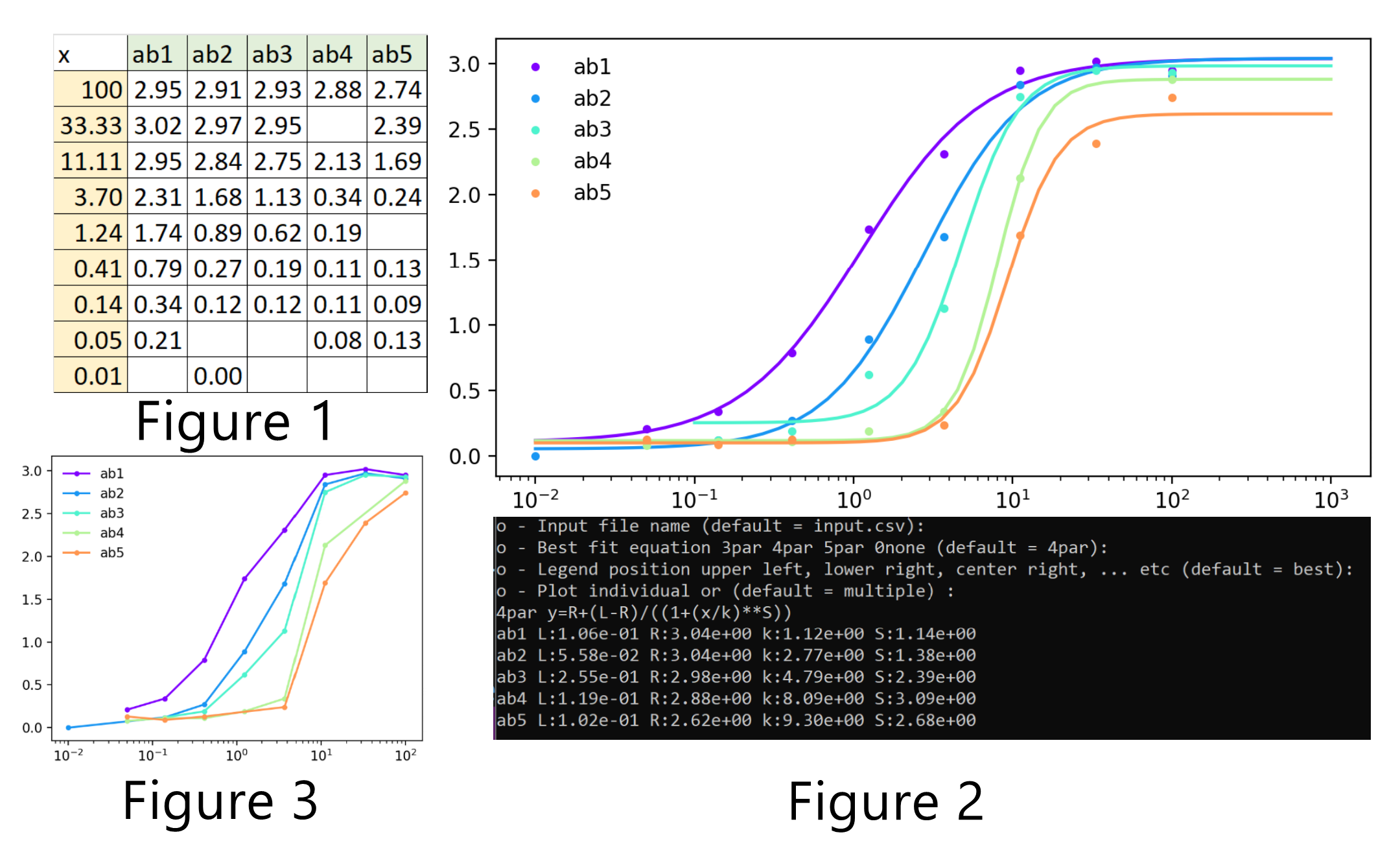
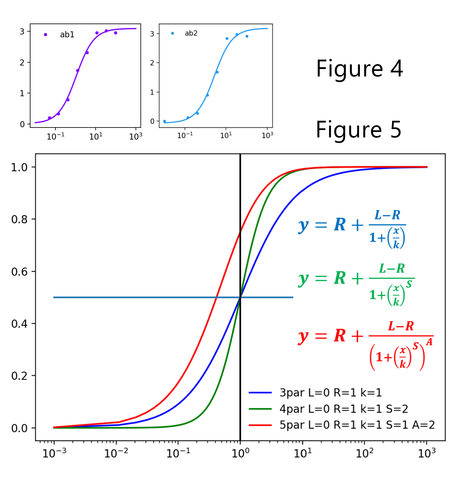
Here are some figures created by the python program:
